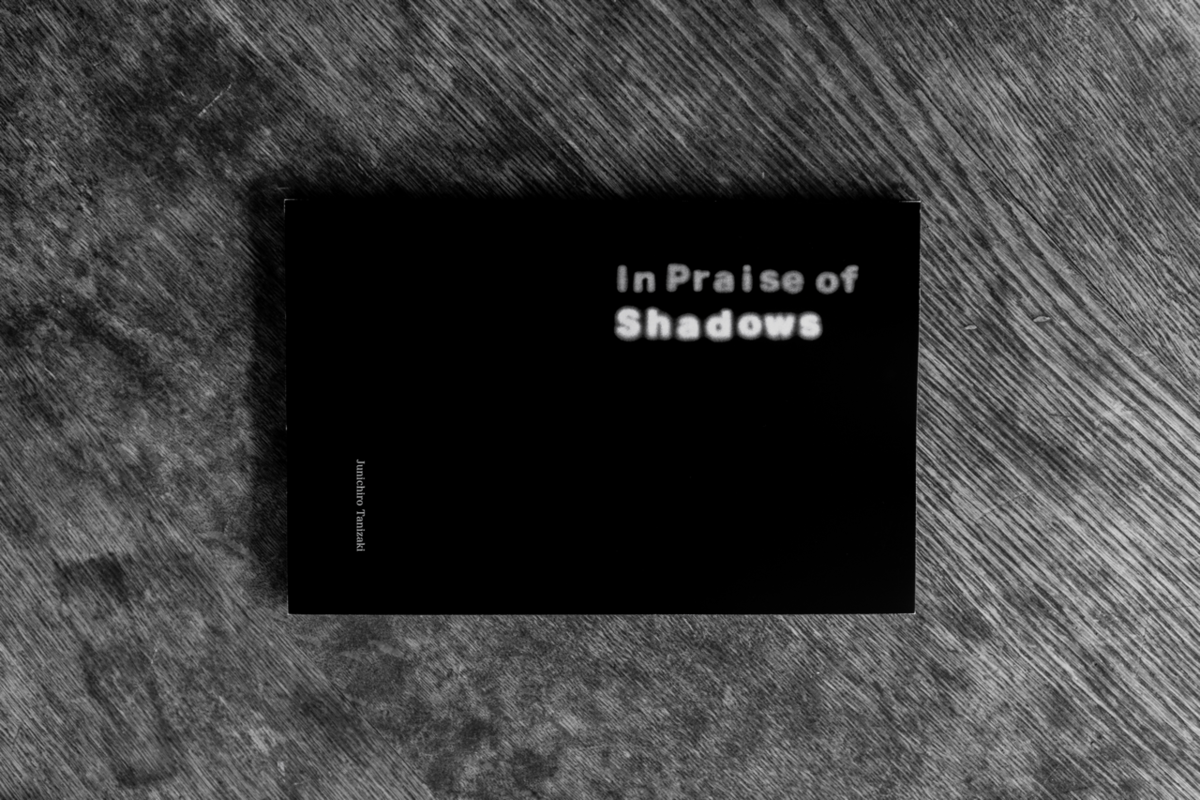
In Praise of Shadows - Book Cover

Overview
⾕崎潤⼀郎『陰翳礼讃』の内容をもとに英語のタイプフェースを制作。これを使った表紙をデザインし、ダミー本を作成した。この作品は東京都⽴⼤学の授業「グラフィックデザイン実習I」の課題として制作された。
I created an English typeface based on the content of Junichiro Tanizaki's In Praise of Shadows. I designed a book cover using this typeface and produced a dummy book. This work was created as an assignment for the Graphic Design Practice I course at Tokyo Metropolitan University.
Concept
フィジカルな⼿法を使って制作したタイプフェースを制作するという課題に対して、『陰翳礼讃』のメインテーマである暗闇と光の対⽐をテーマにLEDライトの光を⽂字のシェイプに切り取り撮影、その際にテクスチャとして紙を利⽤することでぼんやりと滲んだ光をタイプフェースとして取り出すことができた。表紙デザインでは制作したフォントを主張しすぎない控えめなレイアウトで本の内容にそったデザインとした。
For the assignment of creating a typeface using physical methods, I focused on the contrast between darkness and light, which is the main theme of In Praise of Shadows. I captured LED light cut into the shapes of letters by photography, and by using paper as a texture, I was able to extract a softly blurred light as a typeface. For the cover design, I used a modest layout that does not overly emphasize the created font, aligning with the content of the book.